Labels (choose what you want to read about)

Saturday, May 23, 2020

Pitching for a better pitch map lexicon

Have you heard of the concept that it is words that give shape to thoughts? Without language, it's not just our communication that grinds to a near halt, it's also our very thought process. Stunning but true. Sure you could get by without language to process a few concrete 'things' around you, like trees or dogs. But any moment you want to get to a higher plane of consciousness and develop abstract concepts, you need a vocabulary. And don't get fooled into thinking that abstract is the same as 'theoretical / less practical for day to day life". Even basic concepts like 'money' and 'safety' and 'health'  are abstract, and therefore nearly impossible to process and build off of, without the help of this elegant concept of 'words' that permanently label all our abstract entities and make it easy for us to use and reuse said entities in a jiffy. And it's not just for abstract concepts, turns out we need word labels even for feelings, else we can't really understand our own feelings and turn them around in our heads! Sorry if all that's a tad mind bending. The books "Thinking Fast Thinking Slow" and "Sapiens" have much more on this topic.

Moving on from the super abstract preamble, and on to the (fun) topic of the day: cricket! If you are a cricket fan, you would know how important the concepts of 'line' and 'length' are for bowlers. Length defines how close or far away on the pitch did the bowler place the ball, in relation to the batsman (short ball = it will bounce up near batsman's waist or higher; full ball = it will bounce near his toes). Line defines whether the bowler placed the ball close to the stumps (and thus batsman's body) or farther away. The pitch map below illustrates length.

What is the meant by back of length bowling in cricket? - Quora

Every single trick a bowler has (swing, seam, spin, bounce)...it all boils down to where he places the ball, line and length wise. And yet we have such rudimentary language to describe line and length. As you can see in the pitch map, length has just 4 very broad buckets - short, good length, full, and yorker (see example pitch map below). Of which really 'Good' is the main length you are aiming for most often (let's keep aside the confusion that a term like 'good' can introduce). Commentators and coaches end up using vague language like 'just short of good length' as a way of describing certain bowling strategies. Line has it even worse. If you have bowled right on the stumps (the blue vertical bar above), then that's easy to describe as 'on the stumps'. Else you are left saying things like "Philander just sent down a great ball in the corridor outside the stumps, around the area of the virtual 5th stump". What the!

Given my preamble about the importance of words and lexicon, you can probably see where this is going. So my suggestion is simple: let's introduce a more scientific and descriptive notation system for lines and lengths. As you can see from the pitch map, even though the cricket pitch is fairly wide, bowlers place their deliveries in a pretty narrow band. So I suggest we label out the corridors alphabetically. See below. L is Left stump; M is Middle stump; R is Right stump. On the offside corridor, you start with A and keep going outwards. And on the legside corridor, you start with X and keep going (you can use AA after Z, but few bowlers ever pitch that wide out).


Next we solve for length. First we start a measurement clearly from the crease. Then we have a simple numerical notation: box 1 is the one closest to the crease, box 2 after that and so soon. I am suggesting 7 boxes to go up to the half-way mark, so you can get a lot more descriptive than 'full' / 'good' / 'short of good length' (whatever the hell that is) / and 'short'. But really, it could be any number of boxes so long as it's standardized.


And as soon you place the two together, you are able to describe very specific set pitch placement points ("if you want to aim an uncomfortable ball into the ribcage, box B3 is where you are aiming for", instead of a vague "pitch it on a good length somewhat outside the stumps").


I think the benefits are endless. Some use cases:

1. This lexicon can make life easier for the likes of bowlers like Ishant Sharma. A difficult to follow instruction like "you are a hit-the-deck bowler which is great, but you sometimes need to slip in wicket taking deliveries ie pitch fuller without going too full" would become a much easier "you are usually in zone 5; try slipping in some zone 4s occasionally".

2. Young bowlers can also become much more targeted in their training programs ("I am going to keep aiming for L3-A3-B3 as my sweet spot").

3. Pitching strategies can become more sophisticated depending on conditions ("this is a bouncy pitch; you all need to move half a zone up to achieve same level of bounce. Ishant - try first half of zone 3 instead of zone 4"). I am sure this happens today but now we are getting more descriptive and tangible.

4. Measurement. As Peter Drucker said, If you can't measure it, you can't improve it. Coaches and bowlers everywhere can start measuring their lines and lengths in a consistent manner and thus start becoming better players. I could even imagine training pitches physically getting physical grid lines so that bowlers can see where they are pitching with what type of action. Out of form bowlers would know exactly what's going wrong with their pitching. The continuous improvement might become a cat and mouse game: batsmen would learn where certain bowlers like to pitch; they might change their crease position accordingly; bowlers would then adjust and so on.

You might say this isn't some great new concept, and it isn't! To go back to the idea at the start of the blog, advanced vocabulary that give shape to advanced thoughts (and correspondingly, advanced behaviors). Time we applied some advanced vocabulary to cricket's age old concepts of line and length. What do you think?

Disclaimer: I am a true armchair critic when it comes to cricket. Never played anything more than the most rudimentary tennis-ball gully cricket. And haven't been following the professional game either for several years now, so I might be outdated in some areas

Wednesday, April 1, 2020

Mucking about with Capital and Capitalism

I am writing this as of Mar 31st in 2020, just as the coronavirus crisis is about to peak in NYC. Surreal how this virus has brought this great city to it's knees. I am picking up on one particular outcome of this pandemic - the rental market - and wondering why the market is structured so. So the context is that one of the short term impacts of the coronavirus lockdown has been on the ability of tenants to pay rent. See here for instance: 40% of N.Y. Tenants May Not Pay Rent This Month. What Happens Then?

The news along these lines got me wondering: when practically every business and individual in the country is affected and is going to see revenue / cash flow hits, how is it that landlords are completely protected? They sit pretty behind such ironclad contracts that tenants have to pay the rents, irrespective of how well they (the tenant) or their business is doing. And I don't mean contracts in the legal sense (where it's theoretically possible that renters could have added force majeure clauses if they had had the foresight or the negotiating power). Rather, I mean contracts in the social/cultural sense, wherein our entire model and belief system towards renting rests on the assumption that the landlord never gets any risk exposure to the tenant. Sure, if the tenant goes completely insolvent, then the rent stops and the landlord has to evict and take a hit and move on. But in all other scenarios, whether the tenant's business is roaring, or down 60%, the rent is the rent is the rent. Fixed. Why?

Please note, I don't mean to be a 'commie' or a socialist. By which I mean my question isn't a political question. It's an economics question. After all property is a form of capital, and the landlord-tenant agreement is a form of capital-labor agreement. But is our current model an optimal one, where holders of a certain type of capital take no risk and therefore creates a higher barrier on the true engines of economic growth (individuals / businesses) as they look to create value? By optimal above, I mean optimizing for hard metrics like growth and GDP, I am not even talking about 'fluffy' things like equality or distribution of wealth. Put another way, would we have been creating more jobs or companies had capital-driven fixed costs like rent been revenue-linked?

For a typical business, rent cost might 3-4% of total costs, if that. So maybe moving to a revenue-linked rent model may not move the needle. But for retail businesses (restaurants, stores, etc), could revenue-linked-rents drive a fundamental shift in those industries towards more efficiency? I do worry that there are broader mores / expectations / incentive structures at play which may make it quite difficult for a fundamental rethink of how to secure value from property capital. To put it another way, if landlords today are used to securing returns on their assets with zero volatility (beyond the credit risk on the tenant), would they be okay introducing volatility into their cash flows? Even if such a model proves to be better from a systemic / macro-economic growth perspective (big if), what's the incentive at the micro level for the market to move in that direction? Perhaps marginally higher occupancy rates?

Just to clarify, this is a topic that I am not at all qualified to talk about, so this is more idle musing than clearly laid out or justifiable argument. I guess it's finally time for me to finally read Thomas Piketty's 'Capital in the twenty first century'!

Monday, March 16, 2020

A Corona Timeline


A semi-autobiographical account stretching from January to mid-March
  • Detached disinterest. Something's up in China
  • Ah yet another East Asian flu. Deja SARS
  • Lots of Corona beer jokes. Hahaha
  • Oh China...what's with the lockdowns! Will iPhone production stop? Will Apple stock sink??
  • Travel restrictions to and from China! Washington state going crazy! Ooh exciting times
  • Meh. This too shall pass. Warm weather is coming anyway
  • But let's work from home: better be safe than sorry. Yay Netflix
  • Spousal truces over who gets the study desk, who gets to take work calls loudly vs who needs to whisper
  • Wtf just happened in Italy?!
  • Fevered reading up on articles and analysis and data and charts and graphs and projections and predictions
  • Holy moly! Markets in free fall
  • Panic selling! (Of stocks)
  • Panic buying! (Of masks)
  • No bank runs (yet) but lots of grocery runs... Sanitizers cleaned out, wipes wiped out. F*ck it we have soap anyway
  • Dang school are also closed now! So much for Netflix. Full on zoo mode at home
  • Huh some pretty fun WhatsApp and Twitter jokes. Full on tragi-comedy
  • Wade through the tons of spammy corporate emails... "You last used our product 4 years ago but we feel compelled to email you about the steps we are taking for your protection. Though we sell shoelaces". #FML
  • Binge on chocolate. It's the end of the world anyway
  • Guilt trip. Who am I kidding. The chocolate overkill is on me and me alone 
  • Guilt trip #2: doctors and families dying in China and Iran and Italy and here I am wallowing in self pity and chocolate?
  • No basketball. No F1. No tennis. Damn!
  • No distractions: pure virus. Wake up to Corona news. Sleep to Corona news
  • CAN WE STOP TALKING ABOUT CORONAVIRUS? This news overdose will kill me before the virus does
  • I am DONE reading; let's do some long overdue prep work. Why oh why didn't I get toilet paper like the others. Now even Amazon is all out of stock. Stupid stupid stupid
  • No new news for 2 hours
  • 12 hours now 
  • ... 
  • I can't stand the waiting. Bring it on Corona! Let's see this out one way or the other
  • Utter resignation. Ennui. Take me already
  • Shit it has hit the neighborhood! So much for the bravado
  • The end is nea...ah...ah...ahchoo!

Wednesday, December 18, 2019

Bloglet series #2 - the one where I dream of plastic

Why do all voice assistants have female voices?
I was setting up a new Google Home device when it struck me that it's very sexist to have women voicing over the Siris, Alexas, and Google Homes of the world (with the former two even getting female names). Quick googling shows that many have analyzed this problematic issue (one example article here). Research says customers prefer female voices for chores. Well just because there is latent sexism everywhere shouldn't mean companies just pander to it. And meanwhile IBM Watson apparently got a male voice because 'he' will answer technical queries where listeners prefer male voices that convey 'competence'. Grrr

When will phone makers go back to prioritizing function over form?
I have written about glass phone backs and other dumb decisions before. Today my ire is towards Face ID and it's peers. I recently got the Google Pixel 4. Great device but the Face ID (with Radar / laser dot technology and what not) is still not as reliable as a good old fingerprint scanner. Same issue with iPhones. And it's even worse with in-screen fingerprints that Samsungs and others have moved to. A fingerprint recess is always there where you expect it to be, so you quickly build muscle memory and it's near 100% reliable. Tech and ergonomics that were perfected in, what, 2014? But here we are in 2019, still having to do 'lean-over' and 'lay-down' tests to check whose Face ID is less shittier (here). 

I dream of plastic
A few months back I had this day dream where I imagined a world where scientists somehow never invented plastic (at least the polythene kind). Can you imagine how our world would have been? No single use carry bags clogging up sewers, showing up in choked whales' bellies, creating the great Pacific garbage patch, sending microplastics everywhere into the air and oceans. And what would giant plastic-reliant industries have looked like? Fresh food would have maybe gotten packed in leaf wraps or food grade paper / foil? The disposable cutlery industry wouldn't have existed. Maybe we would have a lot more scullery space and staff in fast food restaurants. Amazon and UPS would have relied on cardboard and paper protectors instead of blithely tossing in bubble wrap all over packages. I keep going back to that fantasy and building on it. Perhaps the scientists did invent polythene but it was a super toxic substance. Maybe it was so expensive to make that it never reached mass production. Maybe the environmental ills were co-discovered and acknowledged so that the cost of landfilling / recycling polythene was baked into the cost of production (who am I kidding with this last one). Anyway, I am thinking there is a full book idea in there. After all, I thoroughly enjoyed 'The World Without Us', a non-fiction book about what would happen to the natural and built environment if humans suddenly disappeared. Go 'environment fantasy' as a genre!!

Sunday, December 15, 2019

Bloglet series 1 - the one about animal rights, books, and groceries

My previous model was that full length ideas would come here, and quick thoughts would go to Twitter (@rukeshr), but Twitter has now just become my medium to complain to companies when I get a bad experience. Plus the idea fragmentation isn't nice. So let me try posting quick thoughts here from now on. Will call them bloglets. Yes I know, super imaginative. Somewhere someone must be turning in their graves.
Thought 1: Did you know, 70 billion animals now exist as objects for human consumption, including 60 percent of all mammals on Earth. We find it easy to throw stones at people who lived in the 1700s, saying how could they have permitted slavery. We are no less guilty with what we do with factory farming of animals in this age. The conditions are HORRIBLE, and the numbers are STAGGERING (see 70 billion data point above). Racist, sexist...these are bad terms now. Speciesist needs to get there into the zeitgeist as well (discriminating on the basis of species, by allowing only humans to have rights). This is why I am turning vegetarian again, hoping to go vegan. Will be slightly flexible, but not a lot (e.g. if I am super confident that something is free range, then I might have it)

Thought 2: Human beings are the only animals capable of dramatically changing their software (believe I caught this idea from 'Sapiens'?). Your ideas, thoughts, beliefs...everything is upgradable. And reading books is the most efficient way to upgrade your mental software. Felt the full force of this when I recently read this mind altering book 'Being mortal' by Atul Gawande. Most great books do that. Haven't had that type of experience with TV / movies (even documentaries) / podcasts. And only rarely do interpersonal debates drive that type of software upgrade

Thought 3: For carrying groceries, use backpacks instead of purpose built reusable bags. Apparently reusable bags are making the problem worse (read here). My personal experience was that those totes / bags were darn inconvenient. Very little carrying capacity, poor ergonomics, and easy to forget. After some trial and error I landed on using my trusted backpack for groceries. Never played tennis to the extent I thought I would when I bought the backpack, but now it's super helpful. Carries twice or thrice what a tote would, is not a net new manufacture since I am reusing what I already had, and is easy to sling over my shoulders so I can do multiple chores while still having carrying capacity for groceries in the end. Can this become mainstream please?


Saturday, December 7, 2019

Banking and the poor

Maybe the formal banking sector is not the best solution for the underprivileged after all.  Rather blasphemous thought given my background, but earlier this week I came across this article about mis-selling in India. And then today I was asking the doorman in my building about his experiences using a credit card, and turns out he doesn't even have a bank account, forget a credit card. He apparently once went to a Wells Fargo branch and they said minimum balance $1500 else you get a monthly service fee, so he (smartly) bailed. I thought I would be a good Samaritan and searched for a credit union in the neighborhood to help him get an account, but turns out the credit unions in the area have hidden fees as well! This from non profit institutions! Fees are $2 per month if you dont use your debit card, plus another $6 per month if you don't set up a bill pay (who ever sets up a bill pay). And by the way the account is labeled 'free checking' but these charges were deep in the fine print.

Having worked in a large bank, I realize that brick and mortar banks will never find it sustainable to support low balance accounts. The fixed costs of operating branches plus the weighty legacy tech overhead costs all come in the way. Not that those costly branches are particularly helpful for the underprivileged. The branches are not psychologically approachable, and the staff are often less friendly to poor / financially illiterate customers (the branch reviews for my local credit union were horrible - languid tellers not caring for customers patiently waiting in lengthy lines).

Yes you may say digital is the way to go, but digital only works for 'poor but tech savvy' people. Can you imagine how tough it is for someone to operate a complex financial product* entirely digitally if they don't know the difference between a browser and an app? Add on the reality that these customers usually have a cheap under-powered phone powered by a bargain basement phone-plan that takes several seconds to load a page.

Yes eventually customers will becomes more tech savvy, and at the same time more digital-native financial products will be launched (with presumably user-friendly fee structures and no hidden gotchas, which can be trusted by those with low financial literacy). But in the meantime, I can't think of good solutions for the intersection group of underprivileged + non-tech-savvy than to keep their cash in their pillow.

*Are there in reality any 'easy' financial products? No I am not being facetious. Most of us just got super familiar with consumer banking products over time, but things like deposit accounts or credit cards or loans are not simple or intuitive fundamentally. The poor probably feel inside a branch what you or I might feel sitting in a car repair center (the banker/mechanic will come in presently, explain gravely what is wrong and what it will cost, you will nod sagely and keep wondering whether it's all accurate or you are being scammed)

Image result for car repair

Monday, October 28, 2019

Real steel

I am currently reading a book called 'Man's search for meaning' by Victor Frankl, a Jewish psychotherapist who survived the holocaust. Though only 150 pages long, it's been a tough book to read for me, but also one filled with immense wisdom. Obviously the topic has made me think a lot of what should be the meaning of my own life. And just at this point, I have come across vastly contrasting approaches to how two highly successful people have tried to add meaning to their lives by helping others...

Before his fall from grace, Rajat Gupta was one of the world's most successful people in the corporate world. Global head of McKinsey for almost a decade, he also sat on the boards of the likes of Goldman and P&G, and co-founded the Indian School of Business. He also advised non-profit heavyweights like the Gates Foundation among others. Then of course came the fall - being convicted for insider trading and spending two years in jail. Last weekend I had the misfortune of getting snagged into what I will call this man's 'image repair yatra (tour)', when he was invited as one of the speakers at an IIT Bombay alum reunion. Now, everyone makes mistakes and I certainly don't want to appear holier than thou, but I found his approach very grating. He claims zero culpability for whatever happened, and paints himself as a scapegoat. To my mind two key facts seem to show how hollow that rings: 1. His fellow partner in crime Anil Kumar pleaded guilty! and 2. Rajat never testified in court, claiming the fifth amendment right to avoid self-incrimination. I think if you aren't willing to testify in open court, then surely you are guilty. Having chosen against that path when the case was live, now he is duplicitous enough to claims in harmless social forums that he kept quiet at the time because of his lawyers' advice! I think real courage would have been to admit that he made mistakes, and then try to rebuild his life from there. But I digress - Rajat Gupta's white collar crimes or his response to the conviction is only tangential to my main topic.

The talk during the event veered to Rajat's philanthropic efforts, and the advice he had to the assembled alum. Obviously I had been fairly put off by Rajat's attempts to whitewash his reputation, so now to have to hear him preaching on philanthropy was a bit much to digest, but I was also put off because I recently read a powerful book by Anand Giridharidas called Winners Take All (must read btw!). In that book Anand ripped apart what he called a charade by the elites to change the world while only serving themselves, whether consciously or, if you want to be more charitable (if I may use the word), sub-consciously. Rajat's philanthropy efforts all fit into the classic flawed playbook that Anand described: pure advisory activities vs feet on street, shotgun application of the consulting toolkit vs a true emphasis on changing the status quo, a premature focus on 'building institutions' and 'scaling' without having first created a sustainable model, so on. Now, I do think that lots of times change can be catalyzed by throwing smart people (and lots of money) at societal problems, but often times the connection to ground realities is lost. But one point Rajat made in particular rang loud and clear in my mind: "education is the great leveler". Rajat brought it up in the context of why he co-founded the Indian School of Business (ISB). While I loved the concept of education as a leveler, and appreciate it the more I think of it, I just couldn't reconcile how Rajat believes that he is changing any underprivileged lives or 'leveling the playing field' by founding an elite business school that accepts candidates who are already at the top of the education / early career pile, and regurgitates them into corporate warriors who usually continue to have no impact on society or the underprivileged (fear not, I am myself a product of this system, so there is a good bit of self-contempt in there).

Dr Abraham George's philanthropy style can't be more of a contrast to Rajat Gupta's. In the outskirts of Bangalore, Dr George personally runs a school for the poorest of the poor called Shanti Bhavan. He is the headmaster and has been running the school hands-on for the last ~20 years, ever since moving back from New Jersey as a successful entrepreneur wanting to give back to society. His experience and struggles are beautifully captured in the 4-part Netflix documentary series called 'Daughters of Destiny' (do watch). Shanti Bhavan believes in starting at the primary education level, before under-privilege can start multiplying it's impact on children. They pick up kids from the lowest strata of society, e.g. 'untouchable' castes, in other words, educating children who were otherwise destined to remain poor and underprivileged. Giving them a true shot at lifting out of their generations-long inequality. The medium of teaching is 100% English - because that's how you get the right jobs. It's a residential school (kids stay on campus for the school year) - to ensure a fully immersive experience without distractions from the curse of poverty. The documentary highlights how much of a struggle it was just to launch and succeed at that one school, when Dr George is ever present and personally managing it. Do you think it would have been possible to launch a 100 such schools and truly maintained any quality / had real impact on the ground, if you had gone 'blitzing this space' as the modern philanthropist playbook suggests?


I think the Shanti Bhavan model requires real steel. It's not glamorous at all - no wining and dining wealthy New Yorkers trying to raise the next $100 million to pour into chasing the forever-elusive 'market sustainable' models, and no bandying about impossibly large impact numbers ("we changed the lives of 300 million people with our new model for XX"). Shanti Bhavan touches a 'mere' 24 lives per school year, but truly changes their lives and their life trajectories. And it has taken Dr Abraham George two decades of 100% involvement to get this far. But what a way to add meaning to his own life and that of so many others! Hats off.

PS: One could argue that me being an armchair critic of Rajat Gupta's philanthropy style is hypocritical - what have I done that I get to take potshots at someone who at least has done something? Maybe fair.

Saturday, August 10, 2019

On value based pricing


TL;DR: 
1. Value based pricing works great when trying to establish pricing premium within an existing B2B relationship
2. It can also work with B2B sales cycles, but a classical approach (quantification of value) may not always work in those contexts. Other elements in the pricing/sales toolkit may serve the purpose better
3. B2C value based pricing is a tricky affair. Works at the holistic level but too much of it may end up alienating customers 

I have always found value based pricing fascinating: conceptually it makes so much sense, but psychologically, many customers find it difficult to digest. Quick recap first: value based pricing is the approach of anchoring your price point as competition's price + x (where x is the incremental value your product adds vs competition), instead of the typical 'anchoring price against your cost'. Of course it makes a lot of sense intuitively, customers care about what value you add to them, not how much it cost you to produce. Or do they? And why is this stuff so difficult to pull off if it's really intuitive? And are all companies that use cost-plus pricing doing it wrong? Let's explore.

In my experience I have seen value based pricing (VBP) work most effectively in B2B settings, where customers are more likely to listen to an analytical but almost too-transactional quantification of how much more value your product/service offers vs others. But despite the transactional nature of it, VBP is perhaps most useful in settings when you already have deep/warm relationships with customers. Settings where customers are (strategically) already seeing the real world worth of your product or service everyday, and (tactically) tied at the hip with you. In those contexts, VBP is a handy tool to move customers from the gray "I just know these guys are worth the extra" to "This is exactly why these guys are worth the extra". In these settings VBP is also a handy tool to crack the problem of B2B customers not being a monolith: there may be champions for your product in the business side of the customer org, but procurement will still try to drive a hard bargain. I know this dynamic plays itself out in the apparel industry (where top suppliers do command a premium for valuable differentiators like sustainable operations, ethical hiring practices, co-design studios and the like), and can imagine how it might be playing out in the cloud space as well (tensors?).

The tricky bit is: How do you crack a new B2B client when you know that your product is demonstrably better? It's not like your prospective customer is seeing that incremental value already: they would be wondering and arguing internally, is it all a mirage or is it real? So how do you get them to part with hard earned cash when there is a rather acceptable (and also conveniently cheaper alternative) out there? I live this reality every day at work from the customer side, where partners / vendors are looking to sell to my firm and we struggle to decide which way to go (get the supposedly superior but pricier option, or stick to a tried and tested package). In these 'new sales' situations, I have seen the classical VBP 'quantify the incremental value' approach fall short. Because data is messy even with an existing relationship / operation, how can an external firm come up with bulletproof data and projections that supporters and detractors will all agree to? And peer benchmarks often get scoffed at: "our situation is unique". I don't think there is a silver bullet solution. Here is my suggested arsenal:
  1. Get the basics in place. Build a deep understanding of client use case(s). That way in conversations you are hitting the right notes vs going off on tangents / hypotheticals. Also in this bucket of hygiene factors, have a high quality solutions team that is on hand during the deal, and also later so you are truly walking the talk. 
  2. Share case studies / testimonials. These do matter a lot, but need referencing with care. Go overboard and you may lose the audience. Get into numbers and your conversation will be at risk of derailing. There might be exceptions, but I think qualitative yet powerful real life success stories win out over numbers 
  3. Pull in the right decision makers and influencers in the client org. This is the most important one by far. Also the hardest and most time consuming, but always worth the effort. For your value based pricing arguments to fly, a senior stakeholder will probably need to get involved, buy the logic, and sign off. Someone who is willing and capable enough to stick his/her neck out for a more expensive and eyebrow-raising proposal. The second type of stakeholder you need on your side is an influencer, someone who will do the legwork and champion your cause, irrespective of whether they are senior or mid level or junior. E.g. if selling cloud solutions, you need someone on the client side who will convince the rest of their org to behave like they are investing in a once in a generation upgrade of IT architecture, not doing a BAU procurement
  4. Various pricing levers. Introductory pricing. Price fencing. Revenue sharing / cost save linked deals. All fair game. But only if you have #3 above. Else you are just kidding yourself that you are doing VBP while the client org is just pushing you to a 'lowest bidder wins' game
  5. Be prepared to walk away. With some clients: just leave it. If they are not sophisticated enough to appreciate your value during the sales cycle and prefer a 'lowest bidder wins' approach, then they are likely not sophisticated enough to utilize your value-add features, and thus may never be a lasting client

So much for B2B. When we move to B2C, value based pricing gets a bit trickier. In the simplest iteration of VBP, many firms do successfully charge a 'clean' premium for products that stand head and shoulders above the rest. Think luxury goods, or even Apple (epitome of tech luxury, despite products like the iPhone being ubiquitous). Their pricing is obviously not just cost plus, as evidenced by the higher margins that they enjoy, even after considering somewhat higher costs across the board. But that is perhaps reflective also of the concept of pricing as a positioning choice and indicator of quality vs pure VBP. And as soon as you go beyond the clean 'higher price for a more valuable product', the complications begin...

BMW has been facing a lot of flak from customers for the last few years because it began charging for offering Apple CarPlay as an annual subscription service (a couple of hundred dollars per year). Anecdotally and referencing surveys (here), I can say that CarPlay and Android Auto are super valuable features for car buyers, so why aren't they willing to pay for the value? Granted, the value and price comparison for CarPlay here is against a base functionality (a BMW car without CarPlay) vs against competition, but the concept should hold and somehow it doesn't. BMW tried bundling CarPlay with other features, they also tried explaining that there is real development cost associated with keeping a CarPlay instance up to date (whoa: so it's cost plus pricing then?), but to no avail: customers keep complaining. I think part of it is because no other carmaker on the planet charges for CarPlay or Android Auto, either upfront during the purchase or over time.

But even when everyone does it, sometimes B2C customers just don't like paying extra for each extra feature (think of frustrations with cable companies when they charge extra for set top boxes). Must be something to do with the mental fatigue of applying your decision 'muscle' again and again, for the base product as well as each incremental feature you would like but costs a little more. I recall decision science has some fascinating findings in this space, e.g. why do we happily spend $2 asking for guacamole on a burrito, but struggle to pay for a paid app on the app store that costs the same $2? Some related commentary on this topic in one of my earlier posts here. But fatigue apart, there might be another psychological factor at play: no one likes hidden costs or being 'nickel and dimed' or 'gouged', which is what VBP for features can appear to be (value extraction in more technical terms). So fatigue and a sense of fairness/transparency, two related but distinct reasons why customers may sometimes prefer a single all-in price.

In contrast to all this, Costco successfully anchored it's entire business model on an alternate approach to VBP: honest pricing. Never charge more than 14% margin; pass off the rest to customers. In a retail landscape where true cost of goods can get difficult to assess, customers lapped it up and the rest is history. This is not at all to imply that Value Based Pricing doesn't work for B2C. Tesla for one has shown that customers will accept step-pricing even if not anchored in cost (lower Tesla variants have their range limited by software, a limitation which can be removed for a few thousand dollars, but the net cost of upgrade to Tesla is clearly zero since the car came with the higher range hardware pre-installed). And customers seem to be ok with that, but then Tesla has it's own unique set of circumstances (super passionate owners, a very public struggle with profitability so step-pricing appeals to fairness, CEO led transparency in every move, etc).

Messy examples and counter-examples, but hopefully the point is made: Value based pricing (and probably all of pricing) is a complex topic, so there is no one-size-fits-all solution.

Note: For ease of narration, I used the term 'product' everywhere when I really meant 'product or service'

Monday, July 29, 2019

A ThinkPad Phone?

Cross-posting from my LinkedIn


I hate phones with glass backs. They look and feel great but are so fragile. Gorilla glass claims notwithstanding, I can tell from personal experience that glass backs tend to shatter when dropped, even when there is a protection case on (probably because latest-gen Gorilla glass is reserved for the front, not the back). Yet every single flagship phone on the market today has a glass back: all the iPhones, the Samsung Galaxies, the Pixels. The primary reason? Wireless charging. Glass also happens to look and feel more premium, but what’s the point if you wrap it up inside a plastic case anyway? But back to wireless charging. Hard data has been hard to find, but I personally know a total of zero people who use wireless charging. Probably because there isn't that much of a value add to using a wireless mat over a cable. It’s not a materially cleaner look, given the mat itself still needs a cable snaking away to a power outlet. The only valuable use case might be that of super invested users who have several gadgets (e.g. an iPhone + Apple watch + Airpods). For these people the overnight charging situation must get fairly messy (not that the promised Airpower mat for them ever materialized). So my guess then is that less than 1% of consumers use wireless charging, while conversely, say 5% customers might be cracking their phones’ backs due to drops. So unless wireless really takes off suddenly, it seems like a barely useful technology that phone makers continue to embrace in a features arm race. Which brings me to the main point of the article: why does every phone on the market today look more or less the same, and caters to essentially the same customer segment (the one which wants a sexy but super fragile phone)? I believe there is a sizable customer segment out there that phone makers are ignoring. Let’s call it the ‘no-nonsense segment’. I present their case (ahem) for case-free phones.

You could slice and dice the no-nonsense segment many ways, but one identifier could be that this type of customer covers up their sexy sleek all-glass phone with a plastic case. Thus completely ignoring the phone designer’s original intentions (but not deliberately, only due to practicality and with a dash of regret). As per Statista, a whopping 4 in 5 US smartphone users use a case. Think about it:
Haven’t phone designers failed in their mandate if 80% customers don’t use the phone in the intended way?
Now some of you might be going: wait, the Samsung Galaxy Active series (photo below) existed for several years just for this segment and look how poorly it sold. But that was a phone that went too far: looked far worse than the regular variant (see photo below), had plasticky materials vs the sleek regular Galaxy, and cost $100 more, so customers were better off with a regular Galaxy phone plus a standard $20 case, as c|net and other reviewers noted.


Keep in mind, no-nonsense customers don’t necessarily want ugli-fied phones. Yes, there is a sub-segment of customers in there who want absolute protection and don’t mind heavy compromises on aesthetics in the bargain. That is the OtterBox crowd. The rest of us do want a pretty phone, just one that won’t break if we sneeze at it. Car designers have figured that there is a massive mid-market category between low-flung sedans (sexy but impractical) and Jeep Wrangler SUVs (over-engineered for daily use): it’s called the crossover category, and it’s now the largest category in the car industry by far. Ford is even exiting sedans, that’s how hot crossovers have become. Wish phone makers were to tap into the equivalent phone category too.


So how do you go about designing a phone which won’t need a case? The main protection a case offers is for the screen. All phones now have flush glass screens in the front. Again, for that luxurious ‘immersive’ feel that Jony Ive likes to talk about, but which means a tumble will immediately stress the poor flush mounted screen, and a likely shatter if you hit the edge. That’s why most users slap on cases that create a raised lip (immersive experience be darned). So phone designers, why don’t you start by offering off us an all-metal phone with a raised lip in the front? It won’t look as sexy as your immersive screen all-glass back phone, but that’s not real world usage anyway (for most of us). The rest of the phone can and should look exactly the same. Key features:
  • Flagship specs (best RAM / processor, best cameras, etc). This is by far the biggest segment of the market today, and for good reason: we live with our phones 24x7, so most of us spend like kings to get the best. So build a variant going after this customer base
  • Still looks amazing – uses high end materials like steel or aluminum, has the same design aesthetic and general focus on sleekness like the regular version would have (think iPhone 7), with just two differences: 1. Metal back instead of glass back, and 2. A raised lip to protect the front screen
  • Perhaps 3.5mm headphone jack? This way phone makers could cast their net wide and re-serve a customer need that has also been ignored for flagship phones
  • A tempered glass screen protector pre-installed. Many no-nonsense users get this added protection at the store or apply the protector themselves, a fairly labor-intensive process. A factory pre-installation might be appealing
  • Ideally exact same price, at worse $20-$30 more (the cost of a typical case + tempered glass protector). The proposed no-nonsense variant can probably be produced at a cost close to the regular variant (glass costs more than metal, especially the Gorilla kind). And when the cost between two or more variants of a product is not too different, deliberately maintaining a single price point helps avoid buyer indecision and forces buyers to pick which variant truly fits their needs, versus fixating on the price difference. Swatch and iTunes have exemplified this approach – more on this topic in this HBR pricing essay (see part 4).

While we are dreaming, here are a couple more features that could be great but are probably not doable:
  • Slightly thicker device, but therefore larger battery. Many no-nonsense segment users will probably prefer more battery life if it means a 1-2mm thicker phone. The Samsung Galaxy Active went down this path. The challenge? The bigger battery will cost more to the extent that the price point will have to be different, by say $50 or $100. And buyer psychology makes this a no-no (“I love it but won’t pay extra for it”). Unlike a visible/tangible feature like say a ‘plus’ sized screen, more battery life is one of those intangibles that no one may turn down, but no one will pay extra for either. App makers know this tragic psychology all too well – we all think thrice before spending $2 on a paid app
  • Removable battery. Great for environmental sustainability / multi-year use of phones, and for power users who like to swap batteries towards end of day. The challenge: major hardware design compromises. Read here
Still, looking pretty good with the metal back, a front rim to protect the screen, and a 3.5mm jack right? I imagine the key challenge would be in designing a metal lip that holds up over time without denting too badly (the plastic/rubber used for rims on cases is obviously better at shock absorption). Perhaps one could design an otherwise-metal phone with a hybrid rim material that somehow feels rigidly put together and luxurious? I would love to see hardware designers being asked to work on this type of functional challenge, not just how to make keyboards thinner at any cost (Macbook butterfly keyboard disaster here).

So, which phone maker could try this?
  • Not Apple. They are unfortunately committed too much to form over function. See Macbook keyboard snafu above, plus my last post on iOS (here)
  • Lenovo? ‘The Thinkpad Phone’. Lenovo doesn’t have a meaningful smartphone presence, so this could be an awesome move for them. They might be willing to throw the marketing dollars at this to get a footing in the smartphone market
  • Google? ‘Pixel Steel’. The Pixel is languishing in sales despite being amazing. Mostly to do with distribution (was only sold at Verizon or directly online till recently), but could this be a great move for Google to carve out a potentially large segment all for itself? Maybe this even replaces the regular Pixel instead of supplanting it – at least as a massive test for one generation? Else marketing gets spread too thin
  • Samsung? ‘New Galaxy Active’. Samsung has clearly invested in this category for a while but without much success. Perhaps a reboot?
Readers: would you buy a phone like this? Won’t offer as much protection as a case will, but will get you 80% of the way. In turn you get to use a sleek metal phone vs one you will have to cover up in a plastic case. And this way you no longer need to envy those annoying people who don’t use a case, who evidently don’t mind breaking their phones (or are paying $200 in insurance to experience freedom from cases). 

Please share your thoughts!

Sunday, July 21, 2019

Is iOS intuitive any more?

Cross-posting from my Linkedin

The iPhone OS was game changing back in 2007 when Apple effectively created the modern smartphone. Truly ground up, easy and intuitive to operate even for someone who may not be very tech savvy. But that was more than a decade ago. I am not sure the 'intuitive' title should hold any longer. Having been on Android since the start (minus a fling with an iPhone in 2014), I recently got the chance to use iOS at length because my wife moved from a Google Pixel and got an iPhone. Early impressions have been disappointing to say the least - across software and hardware. But OS/navigation-wise, here are 3 significant misses which have bugged me:

1. Back key is physically in the worst spot possible. Across every single app on the iPhone, if you want to go back one screen, the back key is in the top left of the screen (see image). On large screens like the iPhone X or XS (not to mention the Max/Plus models), that means it's impossible for a right handed user to reach the back key without significantly changing the grip. The idea of a dead spot has been known since at least 2014 (see heat map image below), so I was shocked to note that iOS is still keeping it's main navigation button bang in the dead spot. Super annoying on a daily basis, compared to Android where the back key is so user friendly at the bottom, right in the thumb's arc area. I checked how my iPhone using friends are managing: one of them with the 8 Plus has become a left handed phone user without realizing it!


Thumb Zone Heat Maps - from https://www.scotthurff.com/posts/how-to-design-for-thumbs-in-the-era-of-huge-screens/

2. No clarity on how to reject a call on the lock screen. I literally had to Google 'how to reject a call on the iPhone' because I was looking to reject a spam call and all I could see on the screen was a 'slide to accept' message (image below)! No reject button anywhere. Turns out, apparently you have to double click the power key. Whaaat? So users are expected to pore through the user manual or refer to Google for one of the most basic functions of the phone? Yes I get it Apple: you want to use a slider on the lock screen so people don't accidentally decline calls when phones are in pockets. But there is a simple enough solution to that (which most Android phones use): slide left to reject; slide right to accept. Or top / bottom in the case of the Pixel. We shouldn't need training by NYT (here) to learn how to reject calls!


3. Annoying lock screen camera shortcut. Three weeks in, I still couldn't figure out how to reliably use the camera shortcut on the lock screen (image below). Nice round button but how does it deploy? Is it a double click? A long click? A swipe starting from that roundel, going up or down or perhaps sideways? Whatever I was doing, sometimes it would work and other times it wouldn't. An initial Google search told me there is a better (hidden) shortcut to the camera by ignoring the round button entirely and swiping the entire screen left, which is what I have been doing. It's only for this article that I finally figured out how to make the round button work: it's a 'hard click' (Force Touch in Apple lingo) and not a long click or a double click. Sigh, another hidden navigation approach that requires me to leaf through the user manual to figure out. Meanwhile the Pixel's camera shortcut is also a hidden one (double click the power key), but at least it gives you massive upside once you learn it: this shortcut will work anywhere. Lock screen or not, home screen or not, inside any app on the phone...just double click the power key and boom, your camera is on.


These complaints aren't a knee-jerk reaction to gesture control. Designed well, gestures can become magical for power users, while not coming in the way of the experience for average users (e.g. Microsoft Office shortcuts). But this here is Apple messing up the everyday experience by forcing a mish-mash of four different approaches (1. On screen instructions 2. The power and volume keys 3. Force touch 4. Gesture control) all into a single navigation language.

Make no mistake, these are all small irritations in the grand scheme of things. None seem to be permanent - some Googling or reading through the manual will equip users with answers, but isn't that the whole point of intuitive navigation? Meanwhile, there remain many other ways in which iOS is still a great OS (e.g. the buttery smooth transitions, the lovely thin white bar at the bottom that anchors in your brain as a home key replacement - I haven't missed the physical home key at all!). But the UI/UX disappointments are still many relative to where I expect iOS to be 10 years after launch - especially in comparison to how polished Android has become on Google's flagship Pixel phone.

And Google has been taking UX to the next level on the Pixel: not just placing menus / options where you expect to find them, but using AI (or plain common sense) to assist you in common tasks. Example of SMS contextual options below - without opening the messages app, I can mark a text as 'read', or copy the one time pass code. If it's a personal text, Google auto-suggests responses, which are suitable occasionally if not always. There are similar neat touches across the board which make you feel like you are truly interacting with a 'smart' phone.

And that is the crux of the matter: perhaps Apple - by largely focusing on aesthetics - will miss out on next-gen OS design powered by AI, just like Siri is becoming an also-ran in the war between Google Assistant and Amazon Echo.

Monday, May 13, 2019

Social media and Sri Lanka


There is a lot of scrutiny over social media these days. We have taken off the rose-tinted glasses with which we initially perceived social media platforms (and most of Silicon Valley technology). The initial view of tech and social media as the great liberators, the equalizers and democratizers has been tempered with the realization that these platforms are just enablers at the end of the day, which can as easily be put to misuse as they can be used for societal gain. This topic is still a Wild West in terms of a complete lack of regulation (with political discourse still in it's infancy), several misguided early positions (example here), and points and counterpoints being made across the board (Facebook’s cofounder asking for it to be broken up here, and the counter-argument by Facebook’s VP for global policy here). In this context, Wired.com has come up with two interesting (and contrasting) editorials on the Sri Lankan government's stance to ban social media for a week after last month’s church attacks. Their titles indicate which way they lean:

Don't praise the Sri Lankan government for blocking Facebook

Like guns, social media is a weapon that should be regulated

There is also a rather confused NYT article with opinions that don’t sit well with facts presented within that very article: Banning Social Media Won’t Stop Hate Speech

For what it’s worth, I myself strongly agree with the position that social media is dangerous and should be regulated. Western commentators may not be as clued in to the spread of Whatsapp and how deeply it is now integrated into the lives of everyone in developing markets (and how it has repeatedly caused mob violence / lynchings in India, and similar violence across Asia). Or more insidiously, some of these anti-regulation commentators might be thinly veiled lobbyists for tech companies (more on that later in the post).

Scanning through the various opinion pieces, I see 5 key arguments from the 'don't block Facebook' camp. I have laid out their arguments and my responses to each:

1. "Curbing civil liberties and civil rights doesn’t make people more safe". This is a vague assertion not backed by fact. The essence of civil rights is around avoiding discrimination. From FindLaw: Civil rights are an expansive and significant set of rights that are designed to protect individuals from unfair treatment; they are the rights of individuals to receive equal treatment (and to be free from unfair treatment or discrimination) in a number of settings. And on Civil Liberties, from Brittanica: Civil liberty is freedom from arbitrary interference in one's pursuits by individuals or by government. In the case of Sri Lanka's temporary ban on social media, there is no *discrimination* so civil rights are not relevant, and with regards the civil liberties argument, the interference is not arbitrary and is in fact rooted in law (from the NYT article: "…gives Sri Lanka’s telecommunications minister the power to prohibit the transmission or reception of entire categories of messages in emergencies or in the interest of public safety and tranquillity"). So the government’s action was not a curbing of either civil liberty or civil right, and as to the third assertion in the statement, in fact the temporary ban did make people more safe, given that a key channel of hate speech was curbed. See again the beginning of the NYT article: “False accounts of Buddhist monks being attacked spread on social media”

2. “When the press is relatively unfree (as in Sri Lanka), social media is an important alternate source of news and reporting”. Peculiar choice of word ‘alternate’, but perhaps apt given how dangerous both alt-right and alt-media (social media) are getting to be by bending or even completely breaking the truth. I think the pro-regulation Wired article comparing social media to guns is very apt here. To quote: “(Social media’s) defenders are promising that social networks can replace a corrupt system with a user-based one. I understand the attraction of such a claim, even if it is a form of the gun extremist’s contention that the best answer to a bad guy with a gun is a good guy with a gun. That is, a defense based on seeing the status quo as irredeemably flawed, and favoring a type of every-person-for-themself anarchy in its place”. I have personally noticed how easily truth and falsehoods mix on Whatsapp forwards, so I fully subscribe to the argument that an anarchic new media is no substitute for biased or unfree old media. To bring the analogy home to Western commentators, would anyone in their right minds say that in the US, ‘user driven’ platforms like Facebook are strong bulwarks against the scourge of falsehood-peddling media like Breitbart? Going by the US election meddling, the two types of media are equally dangerous (and in fact symbiotic in many ways).

3. Various flavors of “Internet penetration is weak in emerging markets, so how strong is social media anyway” / “Word of mouth still exists and is a more powerful channel for hate speech” / “This ban isn't enough and distracts from long term solutions”. If the state of popular tech in Sri Lanka is anywhere similar to India (and I don’t see why not given economic, geographical and cultural similarities), then the country is probably undergoing an unprecedented spike in smartphone (and thus internet) penetration. Do note, the ‘Don’t praise the Sri Lankan government’ article confuses internet freedom with internet penetration by pointing us to Freedom House. Sri Lanka and most of the developing world now has rudimentary but widespread access to internet via cheap Chinese smartphones. As regards word of mouth rumors (often created by political rabble rousers), yes those exist, have always existed (e.g. Gujarat riots 2002) and will continue to exist. Governments have to continue to solve those, but it’s not an either/or when it comes to different media of communication. Social media is extremely powerful and yet easy to block temporarily at the flick of a switch, so why not do that as a good starting point? There may be some merit to the argument that it distracts from longer term solutions, but frankly that is true of any effective or even partially effective ‘band-aid’ fix in any situation – it always distracts people from a longer term solution.

4. “The government is doing very little to curb sectarian violence” / “Sinhalese – Tamil – Muslim fighting has existed pre emergence of social media (insert any other sectarian groups e.g. Rohingyas – Buddhists)”. Closely related to the previous argument. Yes governance is tough, and yes much more needs to be done. These bans are temporary fixes (the Sri Lanka one lifted at 7 days) while the wounds of sectarian violence often take decades to heal. Meanwhile, stopping the potency of an accessible weapon should be a perfectly acceptable tactic. It has been proven that restricting access to suicide spots (e.g. bridges) truly lowers suicides. So let’s not underestimate the power of tactical approaches.

5. “Social media is a critical form of communication in times of emergency, e.g. Facebook Safety Check”. Emergency communication should by definition be one to one, not one to many. Sure if you are in a city going through a live attack, your childhood friends might breathe a sigh of relief looking at your Facebook safety check mark, but really the most important people to know should be your immediate family / friends, who you would communicate one to one or small group. Yes Whatsapp groups may make it easier to share that you are safe, but it’s not a critical form of communication by any means – those would be your phone’s basic calling and texting capabilities.

An unstated sixth risk is that governments could easily abuse temporary bans on social media and/or increase censorship in the name of security risks. Fair point. We need to keep pushing companies like Facebook and Twitter to do more, and at the same time we need to keep governments on their toes. I have no doubt that Facebook’s lobbyists work overtime to do just the latter – with a mix of direct government engagement like with Sri Lanka’s President, plus via ‘thought pieces’ placed in the news media (could the NYT article – written by a think tank called LIRNEasia – be an example of such a lobbyist effort?). This one is messy, but in any case the risk of overdoing social media controls should not mean that we blanket label any and all government actions as misguided.

In sum, this is by no means a black and white case, but my leanings are clear. What do you think?

On monetary policy

Reposting my thoughts on MMT from LinkedIn, where no one seems to have noticed it. Oh the irony of then posting it here!

__
Good article by the god of investing Ray Dalio. Lays out the theoretical foundation of MMT and some 'unconventional' (to current-gen economists) levers of monetary policy, minus the controversial discussion on political implications. Fairly technical but with a good intellectual payout if you stay with it, irrespective of whether you agree completely or not. My key takeaways / ideas:

1. There is a sound macroeconomic foundation to monetarily supporting individuals in the form of debt write-offs, cash handouts, universal basic income etc. Irrespective of your political lean, from macroeconomics side its difficult to argue why these levers to stimulate growth are any worse than quantitative easing (which is same concept but supporting investors / asset holders over individuals, and in fact with less efficient outcomes)

2. This has been done before! By FDR during the 1930s great depression, to great success and admiration

3. Even if inevitable (per Dalio), MMT / MP3 implementation will be messy. Of course the topic will be heavily politicized, and that may be an understatement given current polarization (at least in the US / Europe)

4. In the US, could student debt be a good place to apply MMT / MP3 when the next recession rolls around? Would achieve dual wins of stimulating growth and aiding millions of individuals, with a clean heuristic for who receives the benefits (modern equivalent of FDR's lending benefits for veterans). It's also a large lever, given student debt levels of $1.5 trillion. And perhaps a reasonable lever from fairness angle. Sure it will benefit college goers over others, but that's a skew that economies will want to encourage as they look to upskill talent pools

Monday, February 25, 2019

What Mexico's Roma taught me about India

I just watched Roma the other day and found it incredibly incredible. Yes, that incredible that it needed one too many incredibles to describe. Unlike other hyped up movies that disappointed me (cough Black Panther cough), this one delivered and how. What I found most notable was the breathtaking cinematography and sound. I have not watched such a beautifully shot movie ever, or one with more evocative sound. Evocative to me though it's set in Mexico of the 70s - because the sounds and sights of Mexico of the time do have parallels to India of the past. But it takes true genius to bring all that to life. Now, I am not a cinephile or anything close, so I am pretty sure there are other beautifully shot movies out there, but with the Oscar nominations for best picture, best cinematography, best sound mixing (and seven other categories for a total of ten nominations), others seem to agree that Roma does set a very high bar. And it's on Netflix so you have no reason to not watch! But movie making aside, what I did want to write about was the inequality and social order that the movie highlights. Warning: minor spoilers ahead.

Roma is primarily a loving look-back at the caregiver who raised writer-director-cinematographer-god Alfonso Cuaron, but it is also about his memory of Mexico in the 70s, and a general piece of art about nostalgia, family, etc. What I haven't seen talked about very much in reviews is how it's also about inequality. Cuaron definitely shows a clear contrast between the haves and have nots in Mexican society, and more hard hittingly, the contrast between owners and servants in the protagonist household, starting with the lavish owner's house versus the ho-hum servant quarter. Having grown up in India, no surprises to me that yes the servant class lives a very different life. But what I never realized was how hard coded the inequality was. That if you are from the servant class in India, you basically almost never manage to break into a different life. Maybe I was deluding myself all my life that in India you can get opportunities if you studied hard, learnt some English, and maybe got a break or two in life.


Well Roma ripped off all those delusions for me. That's because in Mexican society you can visually differentiate between the haves and have nots. People with European heritage are wealthy, have a lot of properties, go to all the right schools, get all the right breaks in life etc. And people with primarily indigenous heritage end up in the servant class or with much lower affluence. See Roma photo that shows the difference in ethnic background between the owners and the maid. No prizes for guessing who is who. And this isn't me speculating based on watching one movie. I have been visiting Mexico City frequently for work for the last year or so, and have observed this divergence first hand. Admittedly that isn't super scientific either, but various demographic studies do back up this fact of Mexican society - check out Wikipedia (EDIT: Cuaron himself talked about the state of Indigenous people in his Oscar winner's acceptance speech). All the movie does is to starkly bring Mexico's well-known inequality to life. And this unfortunate social status quo has been maintained literally for centuries. Think about that for a second. Millions of people have been born, lived and died over centuries, without ever managing to change their social station in life. And we were talking about equal opportunities if folks worked hard?

The difference in the owner versus servant class is visually stark in Mexico, but it's no less rooted in India even if less visually apparent (and hence easy to gloss over). Note that I am deliberately not using the upper class - middle class - lower class terminology. Too many of us Indians like to bucket ourselves into the ethically convenient category of 'middle class', thus absolving ourselves of any responsibility for how broken our social system is. All of us nice law-abiding not-too-wealthy middle class Indians who succeeded in life due to hard work and engineering degrees and IT jobs and whatnot, I bet that every single one of our families had servant help, typically in the form of maids who would clean our houses, do our dishes, hand wash our laundry, even clean our toilets. Maybe not full time like in Roma, but the concept and the inequality was the same. So while we celebrate the rise of India's middle class and our own personal middle-class 'honest' successes, do you think any of the children from our 'servants' ever had a chance in life? Maybe the luckiest and hardest working of them got to become a peon or bank clerk, but definitely not an 'officer' job. No sir, those are for children from English-medium-educated, 'nice middle class' families. Class systems are so deeply rooted in India that we don't even notice them most of the times. And English has become a convenient means of sorting the haves from the have nots. I will skip this convenient middle class terminology now and go back to owner class versus servant class.

'Servant class' Indians in police becomes constables, derogatorily called 'thullas'. 'Middle class' Indians write English medium exams and become police 'officers'
'Servant class' Indians in the armed forces become jawans. 'Middle class' Indians write English medium exams and become army / navy 'officers'
Neat appropriation of a colonial era class system by the caste system in the last 60 years since independence.

I am not saying that there is zero movement from servant class to owner class. There are stray successes that only highlight the exception, not the norm. Social and economic system based inequalities / injustices are so hard coded that we are thousands of kilometers from meritocracy while most of us may like to think we are just a couple of meters away. This isn't just Mexico (ethnicity based) or India (caste based), historical factors prove nearly impossible to wipe away everywhere in the world (e.g. race based in the US). Something that hopefully we will all keep in mind while celebrating the success of Roma.

Bonus read: Old but gold comic about privilege here

Wednesday, January 30, 2019

How car designs have aged

I grew up a big car buff and though the interest has waned a little over the years, I still take a keen interest in cars. Car design (exterior) has been a particular area of interest — there was even once a time when I seriously wanted to be a car designer and even sketched some designs. Having never trained formally in drawing, and not having a good eye for perspective, those designs haven’t aged very well, but that’s beside the point. I was recently reminiscing about car designs that I loved growing up (some of which have aged rather poorly and others that have only become more amazing over time), so I put together this post to do a retrospective on some of the notable designs in my mind over the last 20 years. I think this is especially relevant given many recent design trends (overdesigned cars, anonymous ‘Russian doll’ designs, cheap attempts to buy ‘presence’ with out of proportion grills, or just plain ugly designs). Not to say we are going down a bad design era (Volvo for one continues to knock things out of the park), but always useful to go down memory lane, no? I have given a scoring based on my memory of how I felt about the design at the time, and how I feel about it now.
Caveats
  • Design is a highly subjective matter, so of course your mileage may vary
  • I imagine I have missed a fair number of cars to the vagaries of memory (and to my specific exposure) so this is a rather random collection
  • I worry that over time our exposure to cars on the roads in various levels of maintenance affects our views on the original design. So I tried to pull up brochure photos to try and show the designers’ original vision
  • I have kept aside supercars and the like. The joy of spotting and admiring beautiful design in everyday objects is something different compared to drooling over million dollar cars (my opinion). Then again, not all supercars have great design so I will leave others to pick that thread up
  • I only talk about design in a purely aesthetic sense here (design for the sake of design), keeping aside considerations like space / packaging, safety, etc.

So with all those disclaimers out of the way, here’s my list…
1998 Daewoo Matiz [Then: 9/10] [Now: 8/10]

I remember the first time I saw the Daewoo Matiz in a magazine pic of a pre-launch article. This was the late 90s and I was in absolute awe. The Indian car market was just opening up at the time and compared to what we had on our streets, the Matiz seemed like it had arrived from a completely different planet and era (dang I can’t find that original pic). The extreme cab-forward style, those perfectly geometrical headlamps, the cleanly proportioned body. It was like a new-age Beetle to my eyes. As fate would have it, the Hyundai Santro (aesthetics wise a relative ugly duckling next to the Matiz) won the market and the Matiz struggled for traction after a good first year or two. Over time the Matiz suffered on Indian roads with many ill-maintained examples being driven around or catching dust by the side (plus bad ‘facelifts’), and my fascination went down. But looking back at some original pics, you can see the design shining through. And evidently it was based off an Italdesign concept (read here)!
1998–2004 Honda City [Then: 10/10] [Now: 10/10]
These were amazing low-slung beauties. Clean lines but not at all boring. I loved both the pre-facelift and post-facelift models and still do. In my mind this was a great example of a facelift that moved the model into the future (jewel headlamps and tail lamps). And of course the overall package was amazing, not just the design.

4th gen BMW 3 Series and 5 Series [Then: 9/10] [Now: 11/10]
These cars used to set my heart racing back in the day and have become much-sought after collector’s cars now. Of course that has a lot to do with the engines, handling and all of that (a lot of people believe that BMW was at it’s prime in the 90s in the pre-electronics /mechanical era), but design has definitely played a role. Such well proportioned cars, clean lines, classic BMW angel eye headlights. Especially the E39 5 series has aged spectacularly. I am beginning to think of it as close to the league of the Jaguar E-type in terms of timeless design.
5 Series

3 Series
2003 Subaru Forester [Then: 9/10] [Now: 9/10]
I came across this beauty as the ‘Chevrolet Forester’ in India. Of course destined to fail as it didn’t have the presence or feel of an SUV. (Aside: did the Indian market change any bit in 15 years? The S-Cross still struggles with ‘presence’). But me, I just loved those proportions, that funky tailgate, that hybrid look of a station wagon-SUV. And maybe I have a thing for cars that look like Mark Wahlberg instead of John Cena (thinking of the CR-V and RAV4 progressions over years). The Forester has not beefed up too much in these 15 years, but it has indeed reached an awkward height visually, so lost a lot of the cool factor in my eyes, but Subaru’s Crosstrek has stepped in admirably.
2003 Porsche Cayenne [Then: 7/10] [Now: 9/10]
I think this will be a controversial one. No one seemed to like the first generation Cayenne. This beast of a design was not befitting a Porsche, they said. And Porsche has made subsequent generations less ‘in your face’ and more like a swoopy sports car but on stilts (which has made them lose character IMO — though the latest generation is getting a vibe of it’s own). Call me a hypocrite considering my views on the Forester / CR-V above, but I still love the butch first-gen and how it has aged. Maybe the design would have suited a Bentley more than a Porsche? Sure the front with the teary eyed headlamps was unfortunate like all Porsches of that era including the 911, but even that got fixed by a 2007 facelift.
Glorious First Gen


5th gen BMW 5 Series (2003) [Then: 9/10] [Now: 8/10]
I know everyone hated the Bangle designs, but I actually loved the 5 series of that era (though not the 6 or 7). Have mixed feelings about how this one has aged (brochures look great; on the road the cars look meh; side profile looks out of proportion now - especially the boot). I still rate it an 8 given how big a role ‘flame surfacing’ ended up playing in taking car design overall into the 2000s. Chris Bangle was definitely a visionary — but maybe BMW wasn’t the right brand for him?


2008 Mercedes-Benz GLK [Then: 5/10] [Now: 8.5/10]
This is an odd one. I hated the design at first — thought it was a poor translation of the boxy C/E design into an SUV. But over time it has grown on me massively. Unique design, sweet-spot size, shades of station-wagon / early Forester influence, stands out in a sea of anony-SUVs (including the successor GLC — swap out the badge on that one and no one can tell it apart from a Buick!). I think the GLK’s growing stature is just a darning reflection on the overall design evolution of this decade’s SUVs. The GLK is like the cool anti-establishment truck. Something a wealthier Walter White might drive!

4th generation Mercedes-Benz E class / 2013 facelift [Then: 6/10] [Now: 9/10]
I liked the 4th gen ‘W212’ E class but didn’t necessarily love it. And when the facelift came out, I was very annoyed that Mercedes-Benz had broken away from years of tradition and merged the dual headlamps into one. But I now eat humble pie. Perhaps it’s too early to tell, but I now think this entire generation is a classic. A unique low design, boxy yet sleek. I love both the pre-facelift Pontoon style rear fenders, and the post-facelift LED tail lamps. Compared to the 4th generation’s sharply individualistic design, I hate the latest E class anony-sedan design


Other notable mentions
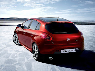
2005 Fiat Punto aka Grande Punto (Giorgetto Giugiaro classic) and 2007 Fiat Bravo (Alfa Romeo masquerading as a Fiat?)

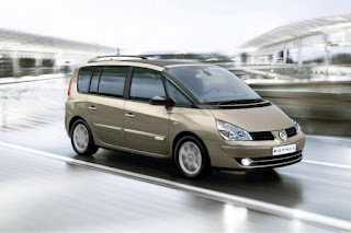
2003 Renault Espace (epitome of idiosyncratic French design that somehow just works). But maybe only on the outside. I know I am not supposed to review interiors, but what were they thinking with that dashboard?


Late 2000s Volvos (C30, S60, XC60, V60). Amazing designs that have aged decently if not spectacularly. Set the stage for the ‘Thor Hammer’ current gen rock stars